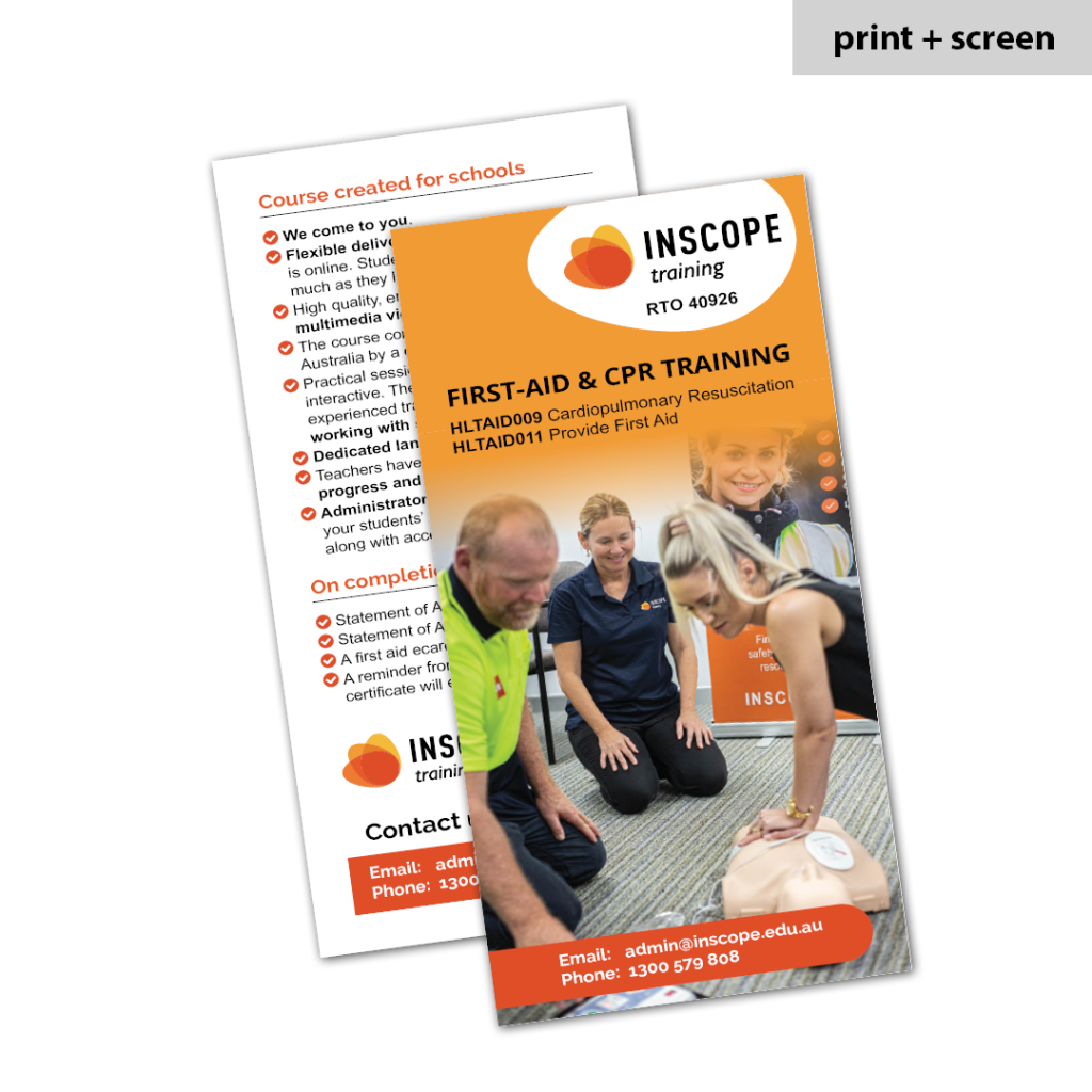
This post is about flyer design tips for businesses that already have branding.
If your business already has established brand guidelines, you’re halfway to consistent, professional marketing — but only if every touchpoint reflects that brand. Flyers are often seen as quick-turnaround, throwaway materials, but they can do real work when they’re designed with intention. Done right, they reinforce your identity, add credibility, and actually get noticed. In this post, we’re sharing 7 flyer design tips to help you stay on-brand, avoid the common pitfalls, and elevate your marketing materials without reinventing the wheel.
1. Start with Your Brand Assets, Not a Template
When you already have a visual identity in place, the goal isn’t to reinvent the wheel — it’s to roll with it. Avoid using pre-made flyer templates that don’t align with your existing brand. Instead, start with your approved brand assets: logos, colours, fonts, icons, and imagery. These elements already do the heavy lifting of brand recognition. A well-designed flyer should feel like a natural extension of your brand, not a one-off piece. Consistency builds trust — and trust gets attention.
2. Keep Hierarchy Clear and Aligned to Brand Tone
A flyer’s job is to communicate quickly — so structure matters. Use headings, subheadings, and body copy that follow a clear visual hierarchy, making it easy for readers to scan the content. But don’t forget: hierarchy should reflect your brand’s communication style too. For example, a corporate consultancy might favour clean, understated headings, while a community-focused organisation may lean into bold, approachable designs. Keep content structured and consistent with your overall tone of voice and visual style.
3. Use Brand Colours with Purpose
Brand colours are more than decorative — they guide how your audience feels. But using them all at once can create confusion instead of cohesion. Refer back to your brand guidelines for recommended colour combinations, and apply them intentionally. Choose one or two primary colours for headings or key callouts, and support them with secondary or neutral tones for balance. This keeps your flyer visually aligned with other branded materials while improving readability and impact.
4. Stick to Approved Typefaces
Typography has a surprisingly strong influence on how your brand is perceived. When you deviate from your approved typefaces, even slightly, the flyer can start to look “off” — even if people can’t pinpoint why. Consistent use of type builds a visual rhythm that strengthens brand recognition across all your materials. Check your brand guidelines for primary and secondary fonts, appropriate sizes, and formatting rules. Avoid the temptation to try trendy or “fun” fonts — they often clash with established branding.
5. Balance Branding with Breathing Room
Just because a flyer is a small format doesn’t mean every inch has to be filled. Effective use of white space gives your content room to breathe, making it easier to read and more visually appealing. Resist the urge to squeeze in too much — overloading the page can quickly undermine your brand’s sense of professionalism. A clean layout signals confidence and clarity. Make sure your design feels well-structured, not crammed.
6. Use Visuals That Reflect Your Brand’s Personality
Images, icons, and illustrations should support your message — not distract from it. More importantly, they should reflect your brand’s personality and values. A polished corporate flyer, for example, might use high-resolution photography with clean lines and muted tones, while a more community-focused brand might use playful illustrations or candid imagery. Always ensure that your visuals align with your brand’s tone and don’t feel like generic stock photos dropped in as an afterthought.
7. Design for Print and Digital from the Start
Flyers aren’t just for handing out anymore — they’re often shared via email, downloaded from websites, or posted on social channels. Make sure your flyer works both on screen and on paper. Use colours and fonts that translate well in both formats, ensure image resolution is high enough for print, and check that text remains legible on mobile. Designing flexibly from the start will save you time and ensure your flyer performs no matter where it’s seen.
Bringing It All Together
Your brand guidelines are there for a reason — they reflect who you are, what you stand for, and how you show up in the world. But they only work if they’re actually applied across every touchpoint. A well-designed flyer can help reinforce your brand identity, communicate clearly, and leave a lasting impression — but only if it’s done right. It should be easier to achieve this by following these flyer design tips for businesses.
Whether you’re promoting an event, sharing a service, or supporting a wider campaign, your flyers deserve the same care and attention as the rest of your branded materials.
Need Help Applying Your Brand to Your Flyers?
Make Better Documents specialise in crafting professionally designed marketing materials — including flyers — that work seamlessly with your existing brand. No templates, no shortcuts, just thoughtful, on-brand design that reflects your business properly.
If you’re ready to take your flyers from functional to fully on-brand, let’s talk. We’d love to help you make better documents.